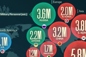
The U.S. controls 40% of global aircraft carrier fleet. Read more

In the war against ISIS, the United States is spending $9 million a day. Two-thirds of this goes to the Air Force – here’s how it breaks down by squadron. Read more
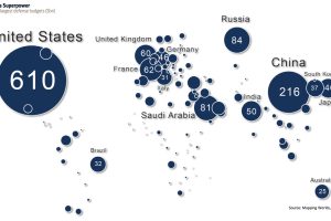
This map shows global defense spending by country – and it puts U.S. military spending into perspective. Read more
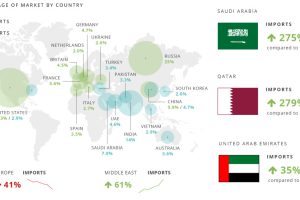
The global arms trade is huge. Estimated to be at least $76 billion in 2013, here’s who is trading arms to who. Read more

Why is the South China Sea so important, and what is the basis for the ruling against China’s territorial claims? This in-depth graphical explainer tells it all. Read more

Lasers, railguns, and hypersonic weapons may sound like they are from science fiction – but in fact, they are just the near future of military technology. Read more
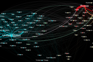
Who sends weapons to who? This data visualization represents the global weapons trade between countries, and it shines a light on two major blocs of trade. Read more
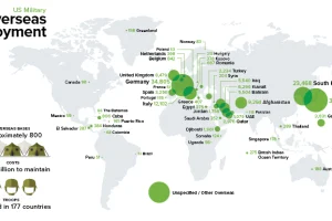
The U.S. spends more on defense than the next 7 countries combined. Part of that money goes to supporting 200,000 troops abroad in 177 countries. Read more


