

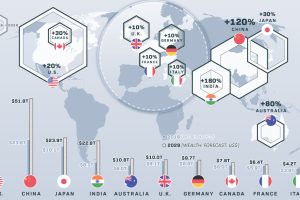
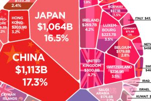
These 10 countries hold 74% of the world’s $204 trillion in private wealth. How will this wealth of nations change over the next decade? Read more
More than $6 trillion of U.S. debt is owned by foreign governments such as China or Japan. See how it all breaks down, and what it means. Read more
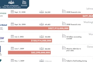
There is always risk in business – but for these 20 companies, which caused the biggest bankruptcies in history, those risks didn’t quite pan out. Read more
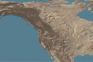
This stunning set of 3d maps purposefully exaggerate the elevation scale to show you the mountains of both the United States and North America. Read more
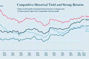
Taxable municipal bonds will help finance the $4 trillion needed for U.S. infrastructure repairs. Here’s a case for why they are an interesting investment. Read more
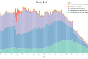
This interactive infographic allows you sort data on the U.S. population using a variety of topics, to see how Americans differ by age. Read more
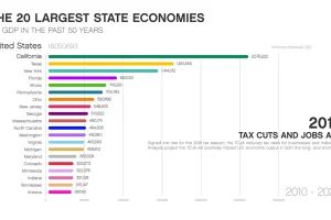
This animation shows how the largest state economies by GDP have changed over the last five decades of time, and what such a ranking looks like today. Read more
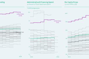
Healthcare spending can be measured as a proportion of GDP, by admin costs, and per capita—and the United States comes in first in every category. Read more
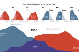
Since 1994, the political divide in the United States has only become more extreme. How have American feelings across major issues evolved over time? Read more

This graphic ranks the top 10 wealthiest suburbs in America, seeing the most entries from California, Texas, and New York. Read more