

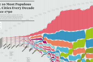
How has the list of the most populous U.S. cities changed over time? This infographic shows the top 10 cities of every decade since the year 1790. Read more

This intense animation plots data on nearly 70 years of arms sales, to compare the influence of the two superpowers from the Cold War to modern times. Read more
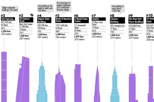
This visualization plots out the tallest buildings in New York City, as well as a few in the pipeline that will change the Big Apple’s skyline forever. Read more
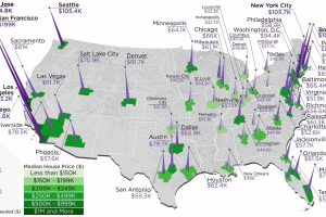
The annual salary needed to buy a home in the U.S. ranges from $38k to $255k, depending on the metropolitan area you are looking in. Read more
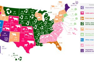
Which agricultural commodity is the most important to each state’s economy? This infographic breaks it all down, based on data from the USDA. Read more
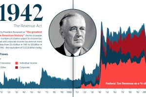
U.S. taxation has undergone massive changes over the last 250 years. From the American Revolution to modern reform, we explore its long history. Read more

How do different types of education (high school, bachelor’s degree, etc.) correspond to level of income and household expenditures? Read more
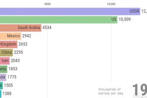
View how the ranking of the world’s largest producers of crude oil changes over a 50 year period, from the Cold War until today. Read more

These 10 countries hold 74% of the world’s $204 trillion in private wealth. How will this wealth of nations change over the next decade? Read more

More than $6 trillion of U.S. debt is owned by foreign governments such as China or Japan. See how it all breaks down, and what it means. Read more