

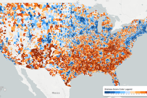
While the U.S. economic picture remains quite rosy, things change quickly when you zoom to the local level. This map shows the country’s distressed communities. Read more
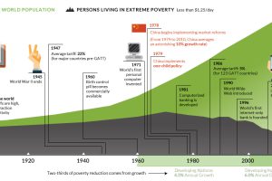
This interactive graphic shows the poverty rate of every state, and also how poverty levels have changed over time according to the U.S. Census Bureau. Read more
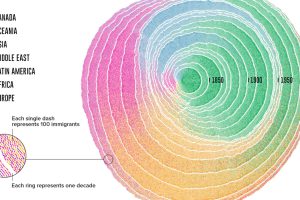
Since 1830, there have been four major waves of U.S. immigration – and this unique video depicts the influx of immigrants as rings in a tree trunk. Read more
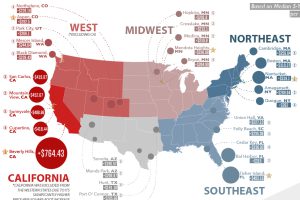
Here are the biggest increases in median housing prices (per sq. ft) over the last 5 years. See where real estate prices are rising (and falling) the fastest. Read more
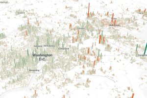
Cities are constantly evolving over time. These 3d graphics visualize both growth and decline with a focus on North American cities from 1990-2015. Read more
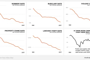
There’s a persistent belief across America that crime is on the rise. This graphic amalgamates crime rate data from the FBI to show a very different reality. Read more

Millions of tons of cargo get moved in and out of the U.S. every day. Which companies are bringing goods in, and which are shipping them out? Read more

The internet is massive and ubiquitous today, but decades ago it was limited to just a few computers. Here’s what it looked like in its early days. Read more

This animation shows the population density of U.S. counties between 1790 and 2010, showing the westward expansion of the country’s population. Read more
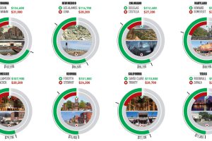
This infographic uses the measure of median household income to contrast the wealthiest and poorest counties in every U.S. state. Read more