

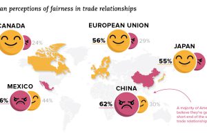
How does the U.S. view its trade relationships? See this recent data from Gallup, which shows how views have changed over time, as well as by political party. Read more
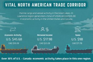
Every year, 230 million metric tonnes of cargo transits through Great Lakes-St. Lawrence waterways to generate a $45.6 billion economic impact. Read more
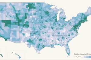
This interactive map allows you to pull data on median household income for all 3,000+ U.S. counties in existence, allowing for some interesting insights. Read more
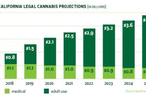
With 39 million people and the world’s 5th largest economy, the California cannabis market has immense potential – that is, if companies can navigate it. Read more
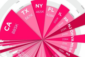
Where do millionaires live in the country? See millionaires by state – in terms of absolute numbers and percentage concentration – in this compelling visual. Read more
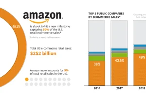
Amazon now accounts for nearly 50% of all U.S. ecommerce sales. This is more than double that of Amazon’s next nine biggest competitors, combined. Read more
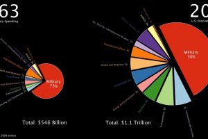
This stunning one minute animation breaks down U.S. government discretionary spending from 1963 all the way until today. Read more
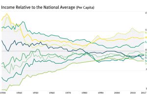
For most of the century, the geographical difference in per capita incomes has been narrowing – but it appears this trend has now reversed in the U.S. Read more
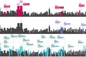
Icons on the New York City skyline, like the Empire State Building, will soon be sharing the sky with a new generation of slender skyscrapers. Read more
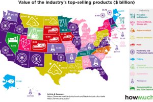
Which industries reign supreme in the United States? This map breaks down the most profitable industry, state by state. Read more