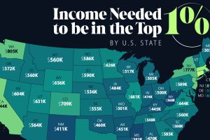
An annual income anywhere between $360,000-$950,000 can grant entry into the top 1%—depending on where you live in America. Read more

Considering factors like the cost of investment and number of locations, this graphic breaks down the best franchises in the U.S. Read more

In this graphic, we take a look at the recent U.S. mortgage rate surge, and how the 30-year fixed-rate mortgage has evolved since 2013. Read more
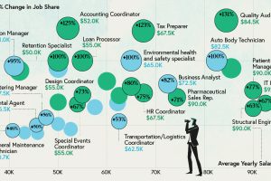
Some jobs need a degree, while others don’t. Here are the top 20 most sought-after entry level jobs with and without a degree. Read more

What does it take to own a home in the U.S. in 2023? Here’s a look at the salary needed for home ownership in the top 50 metro areas. Read more
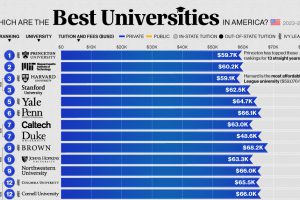
Evaluated on 19 different metrics, here’s the list of America’s best universities, led by 14 private schools. Read more

Nearly 60% of U.S. imports came from just four trade entities in 2023. We rank the top U.S. trading partners and show their growth over time. Read more

More than 45 million American residents were immigrants in 2021, having moved for various reasons. Read more

Media trust among Americans has reached its lowest point since Trump won the 2016 presidential election. Read more
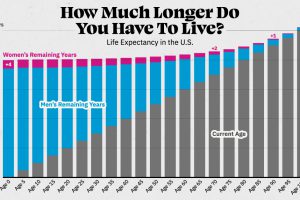
Visualizing the number of years left to live for Americans at every age, reveals the broader trends in American life expectancy. Read more

