

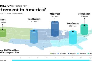
The average American needs their retirement savings to last them over a decade. In which cities is $1 million enough to retire comfortably? Read more
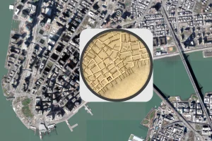
The early 1800s were a time of rapid change in New York City. This map shows the city in 1836, alongside the modern day metropolis. Read more
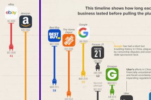
The Chinese market is notoriously difficult for foreign businesses to gain a foothold in. Here, we look at U.S. brands that tried and failed Read more
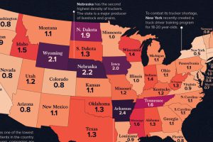
See how America’s 1.8 million truckers are distributed across the nation in these two heatmap visualizations. Read more
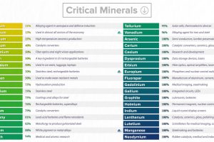
This graphic lists all minerals that are deemed critical to both the economic and national security of the United States. Read more
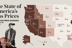
This map looks at gas prices across various states, and historical context for today’s sky-high prices at the pump. Read more

Russia faces a multitude of U.S. sanctions for its participation in global conflicts. This infographic lists who and what has been impacted. Read more
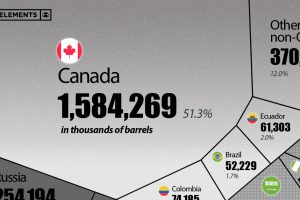
This visualization breaks down U.S. oil imports by country for 2021, showing the split by OPEC and non-OPEC nations. Read more
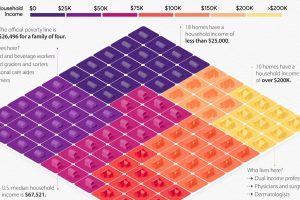
This visual breaks down U.S. household income categories as 100 homes, based on the most recent data from the U.S. Census Bureau. Read more
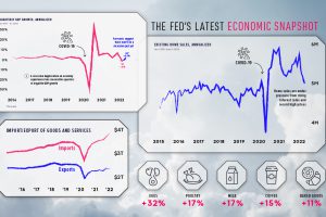
Stay up to date on the U.S. economy with this infographic summarizing the most recent Federal Reserve data released. Read more