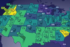
This map shows how many energy projects are in interconnection queues by state and how long these projects have been queued up, on average. Read more
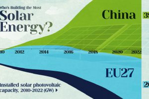
China’s solar capacity triples USA, nearly doubles EU. Read more

The New Visual Capitalist. We launched Visual Capitalist in 2011 with the idea of using visuals to create content for investors with a focus on natural resources. Now it is… Read more
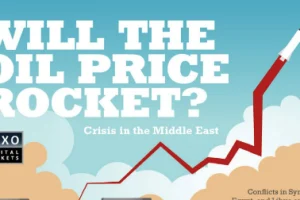
Crisis in the Middle East & Oil Prices Unfortunately, unrest in the Middle East has virtually become commonplace. This unrest is echoed throughout the world through economic impact. More specifically,… Read more

The impact, mindset, and customer base of the collaborative economy. Read more

In this Powering New York slideshow, we visualize what it takes to power NYC with every type of energy including gas, wind, solar, nuclear, and more. Read more
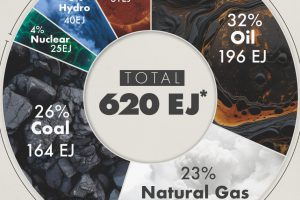
This graphic shows the sources of energy used globally in 2023, measured in exajoules, with fossil fuels making up 81% of the energy mix. Read more

How do the emissions of electric and gas vehicles compare in your state? See if driving a Tesla is better for the environment in this in-depth infographic. Read more
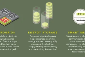
How does electricity to your home? This infographic shows how the power grid works, along with the brand new innovations coming to a grid near you. Read more


