

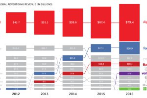
Traditional media is having a tough time keeping up, as Google, Facebook, and Chinese search giant Baidu lead the tech takeover of advertising. Read more
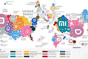
Plotting all the world’s unicorns reveals two big things: extreme dominance by USA/China, as well as the disproportionate size of the Top 10 companies. Read more
How representative is social media of actual regional geographic populations? This map compares both numbers side by side with interesting results. Read more

The many future outcomes from AI makes for a sci-fi writer’s dream. Here’s an entertaining look at what pop culture sees coming from the rise of machines. Read more
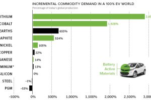
Based on the teardown of a Chevy Bolt, this chart reveals how annual commodity demand would be affected in a hypothetical 100% EV world. Read more

Much of the world’s population surfs an internet that is at least partially censored, and this map shows to which degree that is true for every country. Read more
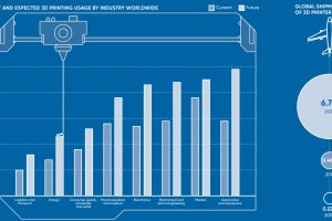
It was slow out of the gate, but 3D printing is here to stay. Here’s a snapshot of the industry in its current state, and where it’ll be crucial. Read more
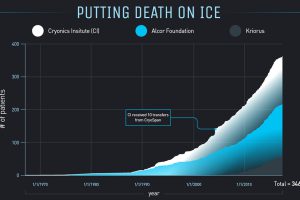
This infographic delves into the mechanics and feasibility of cryonics – a process that thousands of people are betting will give them a second shot at life. Read more
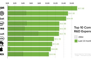
Who spends the most money on research and development (R&D)? We look at the data on an international level, as well as the companies focused most on innovation. Read more
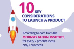
New product ideas only have a 14% success rate. Ignore these 10 key considerations for a successful product launch at your own risk! Read more