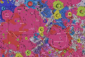
Our solar system is a surprisingly crowded place. This incredible map shows the 18,000 asteroids, comets, planets and moons orbiting the Sun. Read more
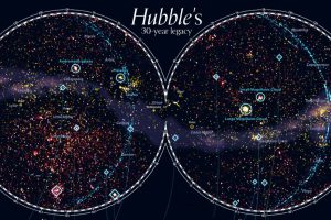
For 30 years, the Hubble Space telescope has been our eye into outer space. This stunning map looks at 550,000 observations made between 1990-2019. Read more
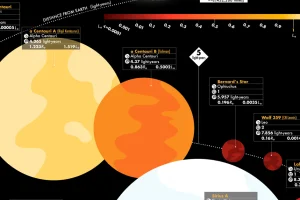
This graphic visualizes the 44 closest stars, revealing key facts such as distance from Earth, brightness, and whether potential planets are in orbit. Read more
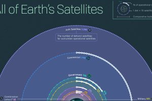
Nearly 6,000 satellites circle our tiny planet. About 60% are space junk, 40% are operational—and hundreds more are launched every year. Read more
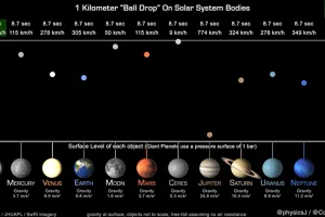
This unique animation, created by a planetary astronomer, compares and highlights the gravitational pull of the planets. Read more
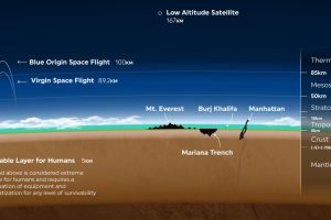
Earth’s atmosphere is thousands of miles long, but only a fraction can sustain life. Here’s a look at how small Earth’s habitable zone is. Read more
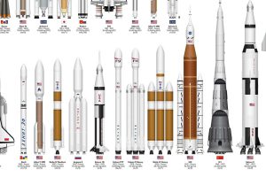
This infographic sizes up different rockets used to explore space, from the USSR’s Soyuz to the SpaceX Starship. Read more
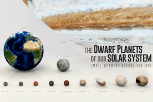
Since dwarf planets started being classified in 2005, nine have been recognized. Here we visually introduce the dwarf planets in our solar system. Read more
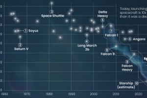
How much does a space flight cost? Here’s a look at the cost per kilogram for space launches across the globe since 1960. Read more


