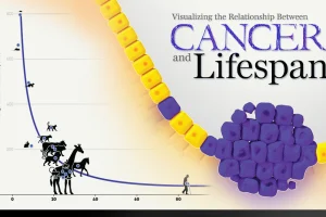
New research links mutation rates and lifespan. We visualize the data supporting this new framework for understanding cancer. Read more
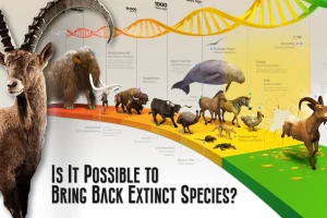
This graphic provides an introduction to de-extinction, a field of biology focused on reviving extinct animal species. Read more
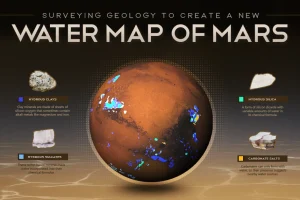
This new planet-wide animated map, based on a decade of space agency research, shows where water can be found on Mars. Read more
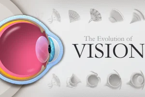
The eye is one of the most complex organs in biology. We illustrate its evolution from a simple photoreceptor cell to a complex structure. Read more
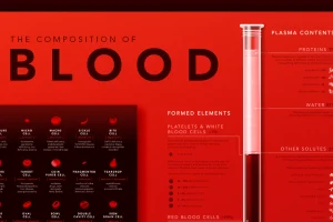
Despite its simple appearance, blood is made up of many microscopic elements. This infographic visualizes the composition of blood. Read more
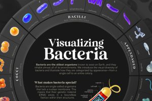
We introduce the visual diversity of bacteria and illustrate how they are categorized by appearance—from a single cell to an entire colony. Read more
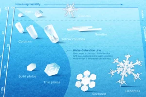
Snowflakes are ice crystals that are beautifully diverse and mysteriously symmetrical. We show what controls their intricate designs. Read more
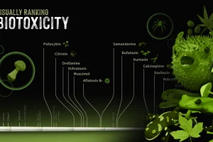
The world can be a poisonous place. We look at a number of different biotoxins found in the natural world and rank their toxicity. Read more
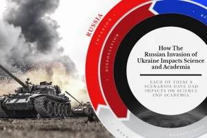
What is the impact of war on science and academia? We examine how nations and the scientific community have responded to the conflict Read more


