Brexit happened and markets are turned upside-down. However, this may only be just the beginning… Read more
Why is the South China Sea so important, and what is the basis for the ruling against China’s territorial claims? This in-depth graphical explainer tells it all. Read more
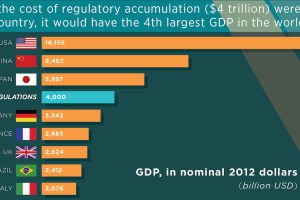
There is now a 180,000 page regulatory burden at the federal level, and one study finds the cumulative impact to be in the trillions. Read more
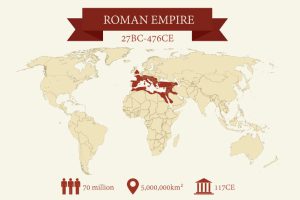
Like the stock market, the greatest empires in history have been cyclical in nature. We look at their rise and fall, and the lessons we can learn as investors. Read more
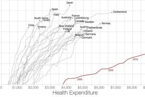
Americans spent more than $3 trillion, or 17.5% of GDP, on healthcare in 2015. Are they getting any bang for their buck? Read more
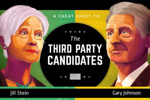
This infographic serves as a cheat sheet to the third party candidates in the U.S. Election, covering what Gary Johnson and Jill Stein are all about. Read more
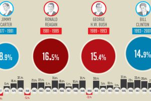
This infographic shows how the U.S. market performs in each year of a presidential term – and specifically, how the market does in election years. Read more

The day before the election, pollsters had pegged Hillary Clinton’s chances of winning at greater than 90%. They were wrong. Very wrong. Read more

Election day is finally here. Here’s 10 charts and maps that will be central to the story as America makes its historical decision. Read more


