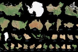
Maps can distort the size and shape of countries. This visualization puts the true size of land masses together from biggest to smallest. Read more
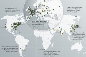
Which countries are turning to nuclear energy, and which are turning away? Mapping and breaking down the world’s nuclear reactor landscape. Read more
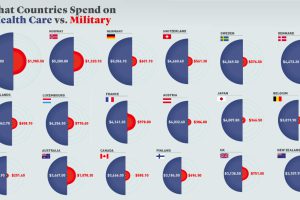
Every year, governments spend trillions on healthcare and defense. But how much is spent per person, and how does this compare by country? Read more

Nothing is certain in politics until the results are in. Here’s a roundup of the most surprising longshot victories in American history. Read more

Picking the right VP makes all the difference to a President’s success. We look at running mates of all Presidential hopefuls since 1940. Read more
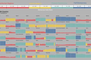
Has the world become more or less free? To find out, this graphic highlights the changing state of democracy in 167 countries since 2006. Read more
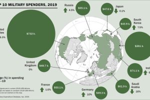
Global military spending surpassed $1.9 trillion in 2019, but nearly 75% of this total can be traced to just 10 countries. Read more
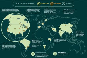
Amid the pandemic, the idea of Universal Basic Income has been gaining steam with policymakers. Where has it been tried, and has it worked? Read more
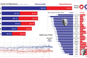
Buckle up your seatbelts—we look at 9 key data-driven charts to get you prepped for this consequential day in U.S. election history. Read more


