

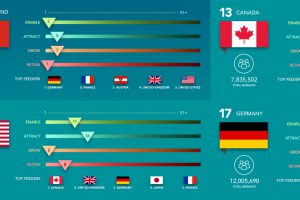
The world’s most innovative companies want to get the best talent at any cost. See whether their home countries are helping or hurting their odds. Read more
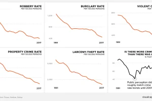
There’s a persistent belief across America that crime is on the rise. This graphic amalgamates crime rate data from the FBI to show a very different reality. Read more
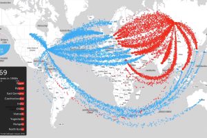
This intense animation plots data on nearly 70 years of arms sales, to compare the influence of the two superpowers from the Cold War to modern times. Read more
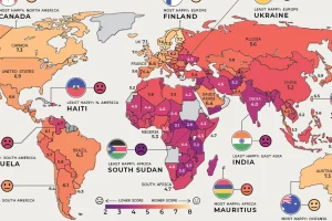
Where are the happiest, least happy, and fastest improving countries worldwide? We’ve broken down this annual ranking by region to answer that question. Read more
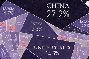
Just 15 countries are responsible for almost three quarters of the world’s carbon emissions. But what does this look like per capita, and over time? Read more
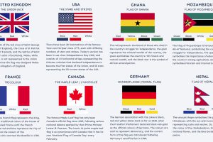
Many world flags are instantly recognizable, but there’s more to it than meets the eye. What are the stories behind some of the world’s most iconic flags? Read more
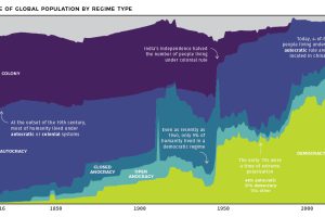
At the start of the 19th century, less than 1% of humanity lived under democratic rule. See how systems of government have changed over the last 200 years. Read more
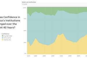
Americans rely on several institutions for their services and safety—but how has their confidence in institutions changed since 1975? Read more
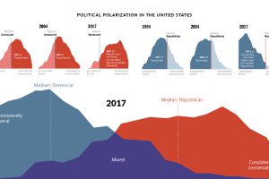
Since 1994, the political divide in the United States has only become more extreme. How have American feelings across major issues evolved over time? Read more
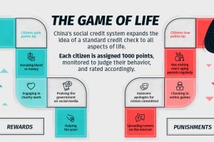
This infographic explores how China’s proposed social credit system will monitor and surveil citizens, and how it’ll be used to reward or punish them. Read more