

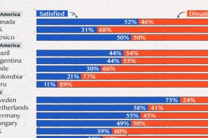
Satisfaction with democracy has declined in recent years, particularly in high-income nations. Read more
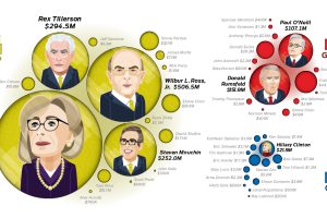
This chart compares the net worth of the initial cabinets of the last three Presidents of the United States: Trump, Obama, and Bush Jr. Read more
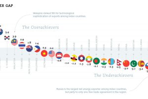
According to the WEF, the retirement savings gap is growing at $28 billion every 24 hours – and it could be the ‘financial equivalent of climate change’. Read more
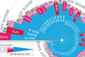
Which state could be hit hardest by a trade war? Here is every U.S. state organized by total economy size, and the share tied to international trade. Read more
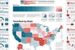
This giant infographic has state economies ranked from best to worst, based on an overall score comprised of 27 different metrics. Read more
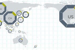
This interactive map uses 114 metrics to measure the geopolitical power and influence of 25 countries, focusing on Asian powers and the United States. Read more
Charting the most influential countries in Asia, plus a look at the countries that punch above their weight class, in terms of power and influence. Read more
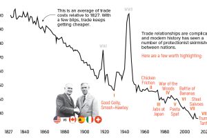
In this fascinating modern history of U.S. trade wars, we show the most interesting conflicts affecting U.S. trade in the last century. Read more
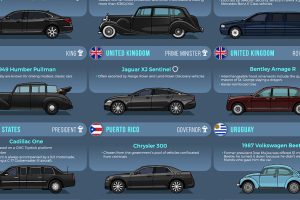
From bombproof luxury to vintage style, heads of state choose a wide variety of vehicles to get around. Read more
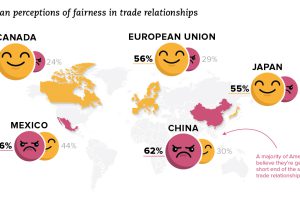
How does the U.S. view its trade relationships? See this recent data from Gallup, which shows how views have changed over time, as well as by political party. Read more