

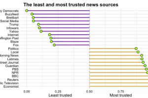
Which news sources do Americans trust, and which outlets do they consider to be full of it? See the results from this survey of >8,000 Americans. Read more
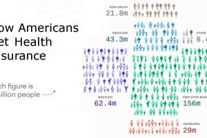
Here’s how Americans get healthcare coverage, using visualizations to show the numbers both nationally and for each individual state. Read more

Much of the world’s population surfs an internet that is at least partially censored, and this map shows to which degree that is true for every country. Read more
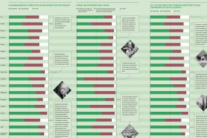
Is globalization a force for good or bad? The answer to this question depends greatly on who you ask – here is a survey of people in 19 countries. Read more
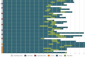
When do presidents start their first terms, on average? Who were the youngest and oldest presidents? It’s all here in this visualization. Read more
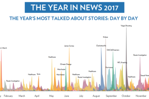
What were the most talked about news stories of 2017? This infographic crunches the data on 2.8 billion tweets to find out. Read more
The decline of freedom has been accelerating around the world. This chart visualizes the context, data, and key countries where freedom is falling. Read more
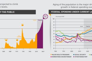
The national debt keeps growing and growing. But what’s driving that trend, and when will the situation reach a critical mass of attention? Read more
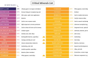
These critical minerals are needed for tech, defense, and industry, yet most of them are mainly imported from outside of the United States. Read more
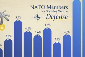
NATO members have significantly increased their defense spending over the past two years. Read more