For decades, hedge fund style strategies have been used almost exclusively by wealthiest investors. Here’s how regular investors can use similar tactics. Read more

We look at 3 major themes that may suggest it is worth owning gold in 2016, ranging from the end of two-term US presidential terms to the gold-to-oil ratio. Read more

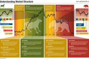
Understanding these different phases of the market cycle will help give you conviction on stock buying opportunities. Read more

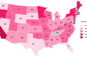
How green is the grass on the other side of the state border? See the U.S. states with the lowest income taxes in this series of maps and charts. Read more

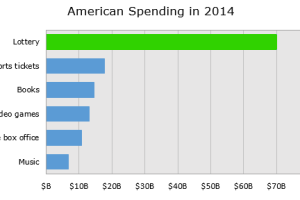
Breaking down the economics of the lottery, we show how the lottery ends up being an excise tax on some of the poorest people in the country. Read more

How do millennials spend their discretionary income in comparison to other groups? We dive into the latest survey results on millennial spending habits. Read more

The story of how Vancouver lost its affordability…and its mind. Read more

New financial innovation in technology is quickly shaping a sector that was entrenched as any. See the evolving fintech landscape in this infographic. Read more

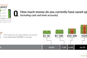
A recent survey shows that most millennials are living paycheck to paycheck. This chart looks at their savings, as well as differences between subgroups. Read more


