

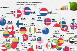
Which countries are best equipped to support their elderly citizens? This graphic compares pension plans around the world. Read more
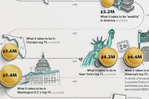
This infographic visualizes several net worth milestones to give you a better idea of where you stand today. Read more
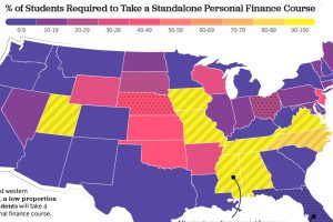
Only 22.7% of U.S. students are required to take a personal finance course. Which states have the highest levels of personal finance education? Read more
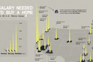
Is owning a home still realistic? This map lays out the salary you’d need to buy a home in 50 different U.S. metro areas. Read more
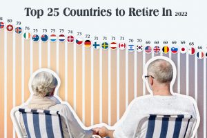
Which countries are the best equipped to support their aging population? This graphic show the best countries to retire in around the world. Read more
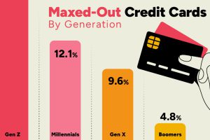
Younger credit card users tend to max out their credit cards more often than older generations, with 15% of Gen Z maxing out their cards. Read more

This infographic shows the net minimum wage across 67 countries, as of January 2023. A breakdown by U.S. state is also included. Read more
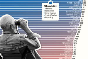
Getting ready for retirement? See which states score the highest in terms of affordability, quality of life, and health care. Read more
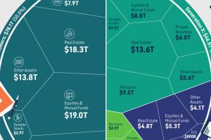
We’ve visualized data from the Federal Reserve to provide a comprehensive break down of U.S. assets by generation. Read more
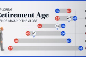
We chart current and effective retirement ages for 45 countries, revealing some stark regional differences. Read more