

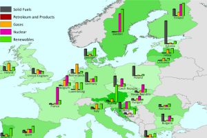
This series of charts and maps show an overview of Europe’s energy consumption, as well as consumption (per capita) by country and source. Read more
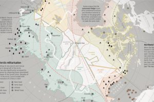
With Arctic ice thawing, the race for natural resources, shipping routes, and other territorial claims is heating up. The race for Arctic Domination is on. Read more
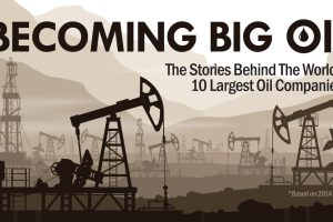
The 10 largest oil companies generated a massive $3.26 trillion in revenue last year. How did Big Oil come to be? This infographic takes a look. Read more
In a volatile market in 2015, the average investor lost 3.1%. In today’s post, we break this performance down by region, profession, and age. Read more
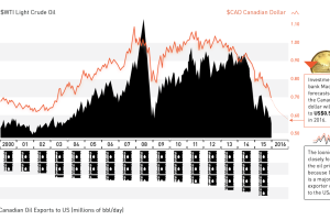
The oil plunge has wreaked havoc on the Canadian dollar. Now at 13-yr lows and expected to go lower, we explain the relationship between oil and the loonie. Read more
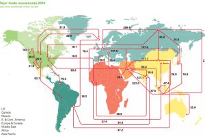
Every day, 93 million barrels of oil are consumed by the global economy. How does this oil change hands? This map visualizes the global oil trade. Read more
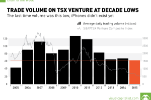
The last time volume was this low, the iPhone did not exist yet. Read more
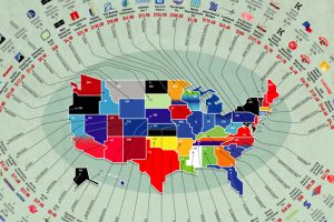
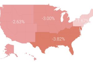
The biggest businesses in the U.S. range from oil producers to retail giants. Here’s a list showing the largest company in each state by revenue. Read more
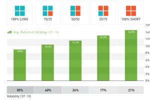
To short or not to short commodities? We take a look at the hypothetical success of a Dogs of the Dow inspired strategy to go long/short commodities over the last… Read more

We look at 3 major themes that may suggest it is worth owning gold in 2016, ranging from the end of two-term US presidential terms to the gold-to-oil ratio. Read more