

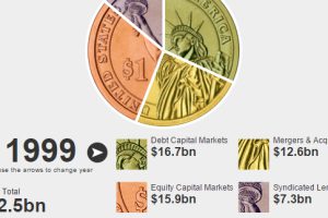
This interactive finance infographic shows the evolution of investment bank fees from 1996 until today. Read more
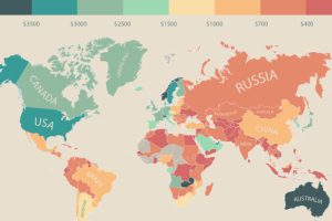
In this infographic, monthly disposable income around the world is mapped by state and country. Switzerland leads the pack with $6,301 in income per month. Read more

Who are the world’s wealthiest people in 2015? This infographic shows the trends as well as the top 10 billionaires, and how they amassed their fortunes. Read more

The performance of this elite group of investors was the worst since the 2008 Financial Crisis. See who made the Hedge Fund Rich List in this infographic. Read more
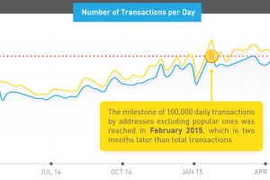
In previous years, Bitcoin received attention as an investment commodity. However, transaction data and top items bought show it’s now for “everyday use” Read more
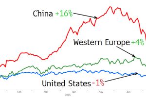
China’s stock market is a roller coaster, creating and destroying trillions of wealth in the matter of months. See how China’s ultra rich fared in the last month. Read more
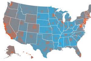
The cost of living by state and county varies significantly. Here’s how far $100 will go in every part of America. Read more

The past, present, and future of money on an infographic timeline. How has technology shaped currency and trade and what does it look like in the future? Read more
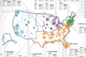
This infographic maps out all of the richest zip codes in America, leaving no country club or gated community unturned. Read more
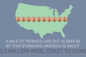
This infographic covers 33 little-known U.S. currency facts about the bills and coins in circulation today. Read more