
This graphic reveals the top 20 highest paid CEOs in the S&P 500 from Sundar Pichai to Jamie Dimon. Read more
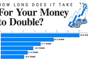
Since 1949, the S&P 500 has doubled in value 10 times. We show how long it takes to double your money across a range of annualized returns. Read more

Global wealth stands at over $454 trillion. This graphic shows how it’s distributed, by various levels of net worth. Read more

This graphic shows how the ultra-wealthy invest their fortunes, from real estate and equities to luxury items. Read more
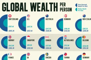
Here’s how wealth per person compares by country to reveal differences in average and median wealth around the world. Read more
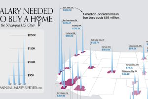
What does it take to own a home in the U.S. in 2023? Here’s a look at the salary needed for home ownership in the top 50 metro areas. Read more

Americans’ collective credit card debt surpassed $1 trillion for the first time in 2023. Read more
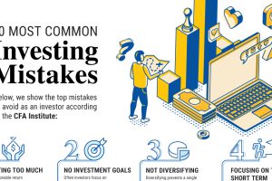
Here are the most common investing mistakes to avoid, from emotionally-driven investing to paying too much in fees. Read more
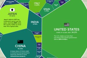
Global debt has soared since the pandemic. Which countries have the biggest stockpile of debt outstanding in 2023? Read more

Donald Trump, Mitt Romney, J.B. Pritzker. This infographic is a snapshot of the richest politicians in the U.S. Read more

