

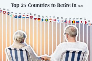
Which countries are the best equipped to support their aging population? This graphic show the best countries to retire in around the world. Read more
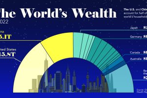
This visualization breaks down how household wealth is distributed around the world. Just 10 countries now account for 75% of total household wealth. Read more

Many countries around the world are facing double or triple-digit inflation. See which countries have the highest inflation rates on this map. Read more
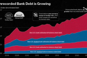
Since 2008, the value of unrecorded dollar debt has doubled. Here’s why this is increasing risk in global financial markets. Read more
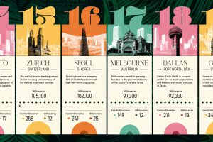
This ranking of the world’s wealthiest cities leverages a robust data set that tracks the location and net worth of ultra-wealthy individuals Read more
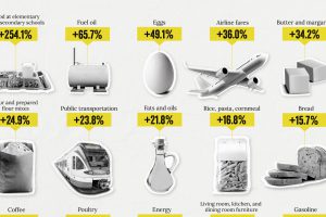
How has inflation impacted everyday goods like milk, flour, or fuel? This chart shows the annual change in the price of basic daily goods. Read more
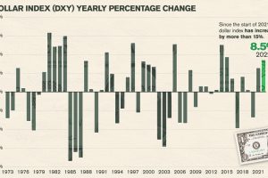
In a volatile and difficult year for many assets and equities, how have the world’s major currencies performed against the U.S. dollar? Read more
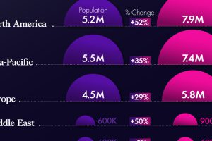
North America and the Middle East have experienced the largest percentage increase in the number of millionaires since 2016. Read more

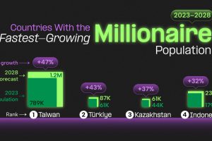
All of these countries are expected to have millionaire population growth rates of over 20% between 2023-2028. Read more