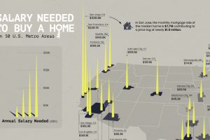
Is owning a home still realistic? This map lays out the salary you’d need to buy a home in 50 different U.S. metro areas. Read more
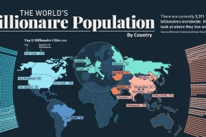
Collectively, worldwide billionaire wealth is nearly $12 trillion. This map breaks down where these 3,311 billionaires live around the globe. Read more
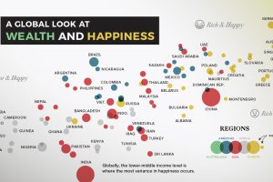
Can money really buy happiness? In this chart, we compare most of the world’s countries to examine the relationship between wealth and happiness. Read more
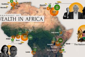
Total private wealth in Africa is now estimated to be US$2.1 trillion. This map looks at where all that wealth is concentrated around the continent. Read more
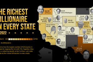
America is home to the most billionaires in the world. But which billionaire is the richest in each state? Read more
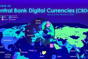
Central bank digital currencies are coming, but progress varies greatly from country to country. View the infographic to learn more. Read more
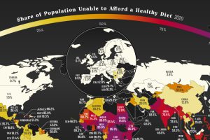
More than three billion people across the globe are unable to afford a healthy diet. See which countries are most affected. Read more
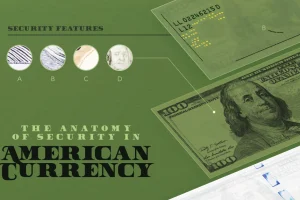
How can you tell a fake $100 bill from a real one? In this visual we break down the anatomy and security features of American money. Read more
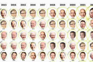
This visualization looks at the ballooning wealth and ranking of the top 10 billionaires over the past 10 years. Read more
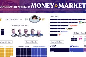
From the wealth held to billionaires to all debt in the global financial system, we look at the vast universe of money and markets in 2022. Read more

