


There is $360.6 trillion of wealth globally. This graphic shows how it breaks down by country, to show who owns all of the world’s wealth. Read more
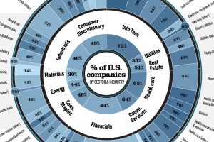
U.S.-based companies have a heavy weighting in global equity markets. In most industries, their market capitalization exceeds 50% of the total. Read more
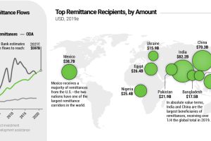
Every year, migrant workers send billions of dollars back to their home countries—reaching $550 billion in 2019. Where do these remittance flows wind up? Read more
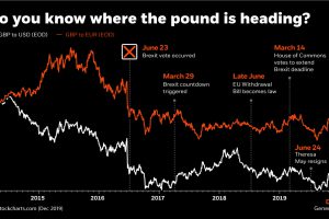
This infographic uses the recent Brexit-related volatility of the British pound to illustrate how currency risk can impact an investor’s portfolio. Read more
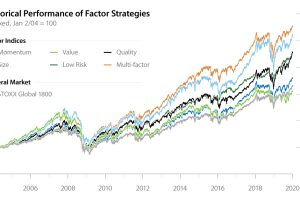
Factor investing has demonstrated its potential to outperform the general market for years. In this infographic, learn how to apply it in your portfolio. Read more
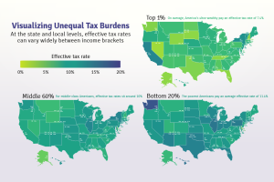
Poor families pay a higher share of their income towards state and local taxes than wealthy families. These maps show the inequitable tax burdens. Read more
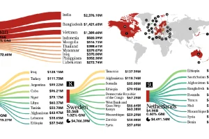
This infographic looks at who is giving – and who is receiving – the billions of dollars in foreign aid that flows between countries each year. Read more
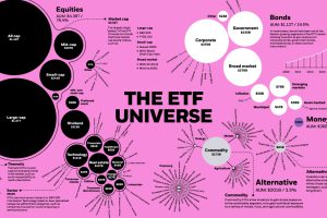
The global ETF universe has grown to be worth $5.75 trillion — here’s how the assets break down by type, sector, and investment focus. Read more
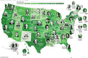
The biggest state fortunes range from $0.3 billion to $117.1 billion (Jeff Bezos). See the wealthiest person in every U.S. state on this map. Read more
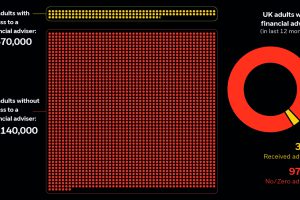
The UK has a financial adviser gap, leaving about 51 million adults without advice. Learn how wealthtech makes investing accessible for everyone. Read more