

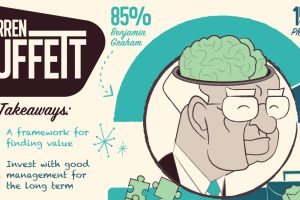
How does the world’s greatest investor think about making investment decisions? Take a look inside Warren Buffett’s brain in this massive infographic. Read more
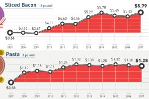
How much more expensive are basic staples than they were 10 years ago? This infographic tracks grocery prices for 30 common items like cheese, fruit, and eggs. Read more
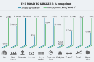
Success means different things to different people – but here’s a look at what it means, on average, when people are asked to quantify success. Read more
In this timeless animated video from 2013, billionaire hedge fund founder Ray Dalio eloquently explains how the world economy works in just 30 minutes. Read more
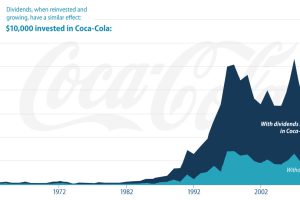
Dividend investing may not sound sexy, but it does generate predictable and powerful returns over time. Here’s everything you should know about dividends. Read more
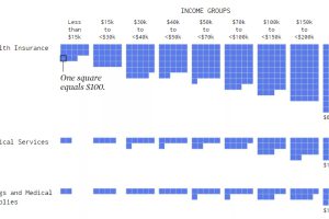
Visualizing how different income groups spend their money on things like housing, food, transportation, health, and travel. Read more

Wealth 101 is a new educational resource that uses infographics to explain topics related to personal finance and achieving financial independence. Read more
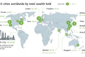
What are the world’s wealthiest cities, and what portion of global wealth is located in each of these key urban centers? Read more
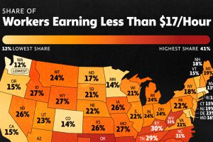
Today, 30.6 million Americans are low-wage workers. In this graphic, we show the share of the workforce earning under $17 an hour, by state. Read more
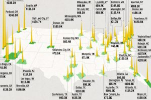
As the cost of home ownership nears record levels, we show the household income required to buy a median-priced home in 50 U.S. metro areas. Read more