
Put down your turkey leftovers – it’s time to recap Visual Capitalist’s top 15 infographics, data visualizations, and charts of 2015. Read more
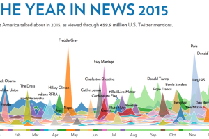
This visualization analyzes 459.9 million tweets over the course of the year to show the magnitude and timing of trending news stories in 2015. Read more

The United States is the third most populous country in the world with approximately 320 million people living within its borders. However, the country is also the third largest in… Read more

The media landscape is changing. Here’s how native advertising is replacing the oversaturated market for traditional ads. Read more
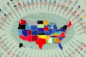
The biggest businesses in the U.S. range from oil producers to retail giants. Here’s a list showing the largest company in each state by revenue. Read more

How much is one new customer worth to a business? This infographic shows how to calculate lifetime value of a customer. Read more
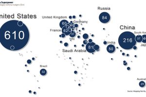
This map shows global defense spending by country – and it puts U.S. military spending into perspective. Read more
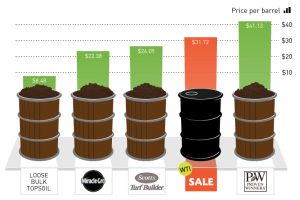
It costs the same amount as a barrel of Scotts Turf Builder. Read more
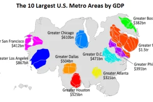
This animation uses county-level GDP data to re-size a U.S. map based on the economic contributions at a local level. Read more
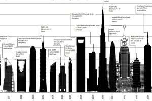
These visualizations show how the tallest skyscraper of 2015 compares to other years, as well as other buildings completed last year. Read more

