
What are the world’s greatest fears? This infographic looks at countries, regions, and demographic data to show the unique differences in fear across the globe. Read more
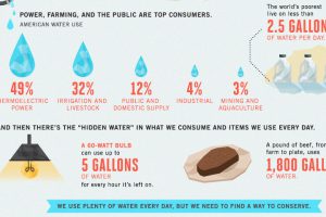
Less abundant water supply, aging infrastructure, and inefficiencies are compounding America’s water crisis as seen in this infographic. Read more
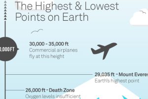
The highest and lowest places on Earth are put into perspective in this visualization. How deep are the world’s deepest mines and drill holes? Read more
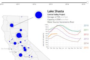
This California drought visualization shows the water levels in each of the state’s largest 30 reservoirs since 2010. Read more

Big construction projects are notorious for going over-budget and getting delayed. Here’s some of the most extreme examples of projects gone wrong. Read more
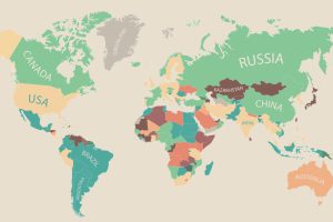
60,000 people in 180 different countries were asked by the OECD Better Life Index what was most important to them, and the data is presented in this infographic. Read more

This infographic presents the data in the cases for millennial entrepreneurs as both the best and worst possible entrepreneurial generations. Read more
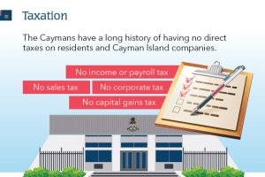
The Cayman Islands have a rich history of indirect taxes and have now introduced a new Special Economic Zone, making it one of the best places to do business in… Read more
The Quality of Life Index is made using seven factors: safety, healthcare, consumer prices, purchasing power, traffic commute, pollution, and property price to income ratio. Read more
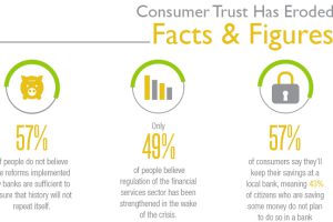
Consumer trust has eroded in the banking system, with only 32% of people trusting their retail bank. Why is trust at an all time low and how can it be… Read more

