Over the last 30 years, the price of airfare has fallen over 50%. The impact has been felt in the tourism industry, which now accounts for 9.5% of global GDP. Read more

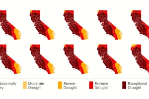
California has been the victim of years of drought now, and this data visualization series shows the cumulative effects. Read more

By 2100, our global population is to be between 9.6 and 12.3 billion. Here’s what peak population looks like and its effects on resource consumption. Read more

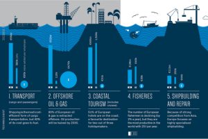
This infographic focuses on Europe, where the United Kingdom is nautical miles ahead of anyone else in terms of developing sea-related industries. Read more

In this list, we count down the 14 best Visual Capitalist infographics of 2014. Read more

This tongue-in-cheek infographic guide will prepare you for potential doomsday scenarios the Earth may face over the next million years. Read more

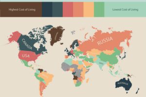
The most expensive and cheapest places to live, sorted by country. Compiled using hundreds of thousands of user submitted price data. Read more

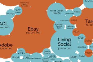
A data visualization showing the biggest hacks and data breaches in history, sorted by number of records stolen. Read more

This infographic video documents several shocking facts about the US prison system. Read more


