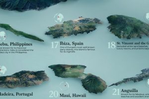
This graphic uses survey data from Travel + Leisure magazine to show the 25 best islands to visit around the world. Read more
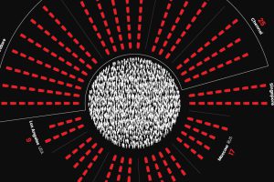
The world’s most surveilled cities contain hundreds of thousands of cameras. View this infographic to see the data in perspective. Read more
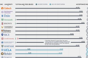
What are the 50 best universities in America? From Harvard (#3) to The Ohio State University (#49), where does your school rank? Read more
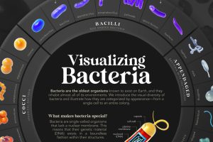
We introduce the visual diversity of bacteria and illustrate how they are categorized by appearance—from a single cell to an entire colony. Read more
Spotify’s ‘Billions Club’ playlist tracks every song with over 1 billion streams. We took the data and broke it down by decade and artist. Read more
Here, we highlight countries that are magnets for immigration, such as UAE and Qatar, as well as nations with very few foreign born residents. Read more

The eye is one of the most complex organs in biology. We illustrate its evolution from a simple photoreceptor cell to a complex structure. Read more
Social connections evolve throughout our lifetimes. Here we chart how much time Americans spend with others, and who that time is spent with. Read more

Japanese automakers like Toyota are known to produce some of the longest lasting cars in the world, but does the data support this claim? Read more
Snowflakes are ice crystals that are beautifully diverse and mysteriously symmetrical. We show what controls their intricate designs. Read more

