

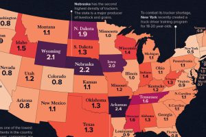
See how America’s 1.8 million truckers are distributed across the nation in these two heatmap visualizations. Read more
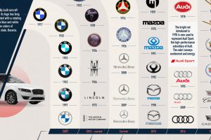
Automakers are some of the most recognizable brands in the world. See how car logos for these select brands have evolved over time in this graphic. Read more
Nuclear weapons have devastating effects, but the science of how they work is atomically small. So, how do nuclear weapons work? Read more
Just how powerful are nuclear bombs? Here’s a look at the top 10 largest nuclear explosions. Read more
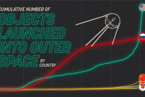
Which countries dominate outer space? This visual displays the number of objects every country has launched into space over time. Read more
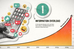
This era of data abundance should be propelling humankind forward, but valuable insights are often lost in the noise. Data storytelling holds the key. Read more

In this infographic, we catalog 33 problems with the social and mass media ecosystem. Read more
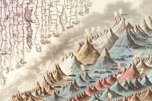
This iconic infographic map is an early and ambitious attempt to compare the world’s tallest mountains and longest rivers. Read more
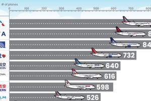
What type of aircraft do the world’s largest airlines use? This infographic breaks down the airline fleets of major carriers Read more
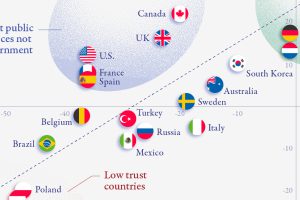
There is a clear correlation between trust in government and trust in public institutions, but a few countries buck the trend. Read more