

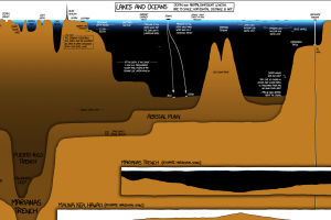
A unique and entertaining graphic that compares the depth of the world’s lakes and oceans, as well as the deepest holes ever drilled. Read more
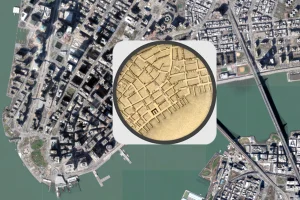
The early 1800s were a time of rapid change in New York City. This map shows the city in 1836, alongside the modern day metropolis. Read more
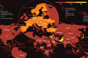
There are 8 common blood groups but 36 human blood types in total. Here we map the most widespread blood types in every country in the world. Read more
Conventional cartographic techniques have caused many to have a skewed perception of the true size of countries. Can an equal-area map provide clarity? Read more
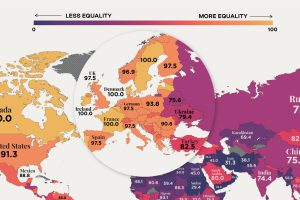
In recent years, many economies have made women’s rights a priority, yet only 10 countries in the world offer full legal protections to women. Read more
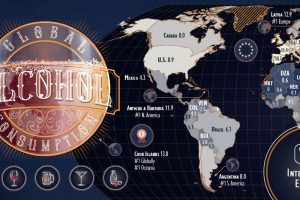
Which countries are the world’s biggest alcohol drinkers? This interactive map explores global alcohol consumption per capita. Read more
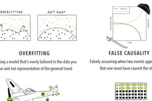
With so much data available, it’s easy to make big mistakes when analyzing and interpreting it. Here are 15 of the most common data fallacies to avoid. Read more
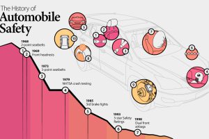
Seatbelts first became mandatory in the US in 1968. Since then, new technologies have greatly reduced road fatalities. Read more

Here are the top 10 biggest companies in Russia, the largest country in the world. Read more
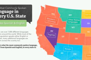
The U.S. is home to a plethora of languages. Here we map the most common language spoken in each state (aside from English and Spanish) Read more