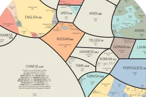
See the world’s major languages broken down by country in this stunning visualization. Read more
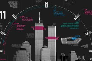
This timeline visualization is a high-level record of what happened on the fateful morning of September 11, 2001 Read more
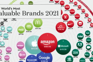
COVID-19 hit the global economy hard, but some companies thrived amidst the chaos. Here are the top 100 most valuable brands of 2021. Read more
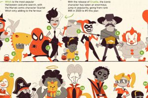
The spookiest time of the year is back. Here we visualize the most popular Halloween costumes in the U.S. in 2021. Read more
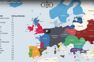
The history of Europe is breathtakingly complex, but this animation helps makes sense of 2,400 years of change on the European map. Read more
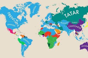
This fascinating map highlights the second most commonly spoken primary language in almost nearly every country. Read more
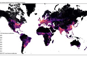
This detailed map looks at where humans have (and haven’t) modified Earth’s terrestrial environment. See human impact in incredible detail. Read more
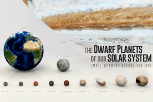
Since dwarf planets started being classified in 2005, nine have been recognized. Here we visually introduce the dwarf planets in our solar system. Read more
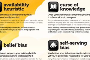
The world isn’t as it seems—here are some of the most important cognitive biases that are messing with how you think the world works, and why. Read more


