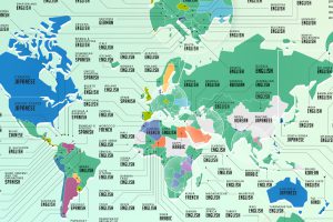
Learning a new language has become a popular hobby during the pandemic. Here’s a look at the most popular languages people wanted to learn around the world. Read more
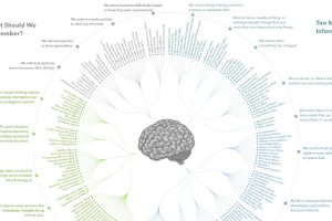
Here’s all 188 cognitive biases in existence, grouped by how they impact our thoughts and actions. We also give some specific cognitive bias examples. Read more
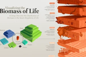
Our planet supports nearly 8.7 million species. We break down the total composition of the living world in terms of its biomass. Read more
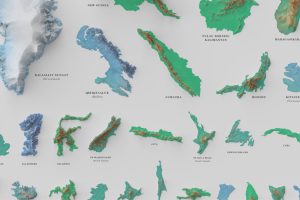
See the world’s 100 biggest islands in a side-by-side comparison. Then, we look to see which islands have the highest population densities. Read more
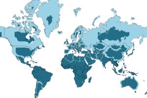
The world map you know is totally wrong. Check out this clever graphic, which helps put into perspective the true size of countries. Read more
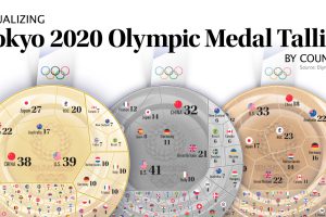
After 17 days and 339 events, the Tokyo Olympics have come to an end. Here we visualize the final medal tallies for every participating country. Read more
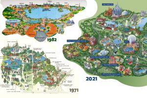
Historical maps highlight the Magic Kingdom’s dramatic transformation from swampland to the biggest theme park in the world. Read more
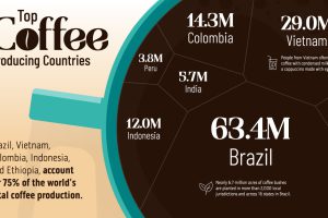
Coffee is the third most consumed beverage globally. Here we visualize the countries that have the highest coffee production in the world. Read more
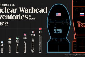
How big is the world’s nuclear arsenal? Here are the stockpiles of the nine countries with nuclear weapons. Read more
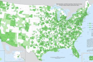
Fitting a complex population center into a tidy statistical box is no easy feat. Thankfully, this U.S. Census Bureau map is up to the challenge. Read more

