Many consumers are reluctant to pay for their news, but those that do turn to trusted sources. Here’s a look at the most subscribed to news websites. Read more
This giant infographic explores the biggest passenger ships on the open seas, over a period of almost 200 years. Read more

Corn has many uses that make modern life possible. This infographic breaks down U.S. corn usage in 2020. Read more
Which influencers have the most total social media followers? We tally up follower counts across all major platforms, from Twitter to TikTok. Read more
How do the big tech giants compare to entire countries? Here’s how Apple, Microsoft, and Amazon’s market caps stack up against national GDP. Read more
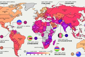
Global happiness levels are determined by many diverse factors. These maps look at the happiest and unhappiest countries in every region. Read more
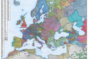
What did Europe look like in the Middle Ages? This map is a snapshot of medieval Europe back in 1444, during the rise of the Ottoman Empire. Read more
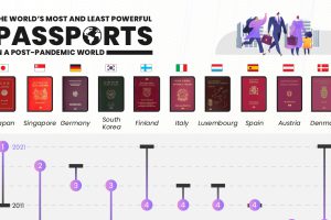
Ranking the the world’s most powerful passports based on access to visa-free destinations. Where does your country fall on the list? Read more

Learn the stories behind some of the world’s biggest Ponzi schemes in this illustrative infographic timeline. Read more


