


Here are 11 common phrases that managers should avoid saying to their teams, and what they should replace them with to get a better result. Read more
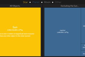
This interactive data visualization illustrates how the different planetary objects in our solar system compare based on their individual masses. Read more
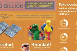
Every year, the global economy loses over $300 billion from the sale of counterfeit goods. Here are the problems created by this, and why they matter. Read more
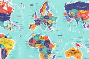
From Colombia to China, explore this map to uncover the diverse histories and cultures represented in the literal translation of each country’s name. Read more
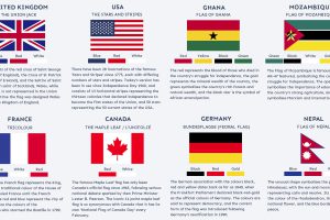
Many world flags are instantly recognizable, but there’s more to it than meets the eye. What are the stories behind some of the world’s most iconic flags? Read more

Trust is the glue of modern organizations to ensure collaboration and healthy conflict. Here are proven ways to build trust with employees. Read more
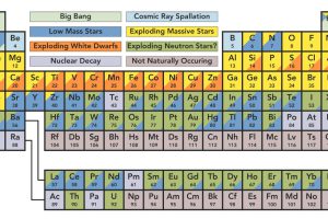
You’re likely familiar with the periodic table, but do you know the origin of elements? This graphic shows where our solar system’s elements come from. Read more
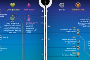
From the Big Bang to the Boomerang Nebula, this stunning data visualization puts the extreme temperatures of our universe into perspective. Read more

This stunning set of 3d maps purposefully exaggerate the elevation scale to show you the mountains of both the United States and North America. Read more

This infographic takes a closer look at the craft beer revolution sweeping across the U.S,. and its far reaching economic impact. Read more