

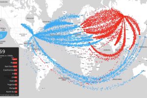
This intense animation plots data on nearly 70 years of arms sales, to compare the influence of the two superpowers from the Cold War to modern times. Read more
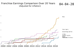
This fascinating animation charts the revenue of some big movie franchises. Watch blockbusters like Marvel shoot up the rankings over time. Read more
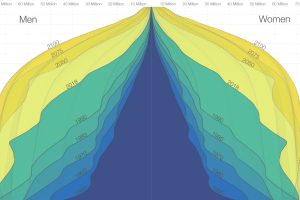
The world is in the midst of a notable demographic transition. Here’s how the world population pyramid will change as we close in on the year 2100. Read more
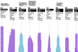
This visualization plots out the tallest buildings in New York City, as well as a few in the pipeline that will change the Big Apple’s skyline forever. Read more
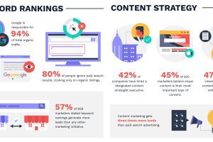
This massive infographic uses 100+ marketing stats to highlight the tactics that are working in modern-day digital universe. Read more
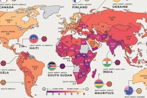
Where are the happiest, least happy, and fastest improving countries worldwide? We’ve broken down this annual ranking by region to answer that question. Read more
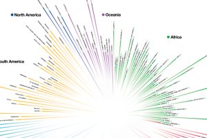
How do countries around the world compare in terms of age? This compelling visualization shows the median age for every country in the world. Read more
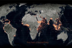
Ever since humans first sailed the high seas, piracy has been a dangerous risk. See instances of modern piracy on this detailed map. Read more

Flying can get you almost anywhere, but often people are journeying between two popular destinations. Here we map the busiest air routes globally. Read more
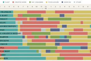
The eclectic daily routines that inspired the world’s most famous creative people to produce their best and most original work. Read more