


The words ‘bad’ and ‘awful’ may not appear very different, but as this sentiment scale reveals, some words and phrases are more potent than others. Read more

Embark on a visual tour of the human body, where each and every part of the human anatomy is re-imagined as a subway stop. Read more

Since 1830, there have been four major waves of U.S. immigration – and this unique video depicts the influx of immigrants as rings in a tree trunk. Read more
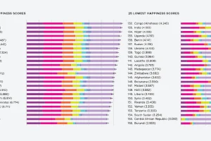
What contributes to happiness? These charts break down global happiness scores – how does your country fare, and how has it changed over ten years? Read more
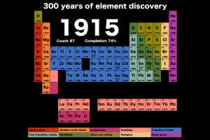
Watch discoveries of new elements as the years flip by, in this short and compelling animation that shows how the periodic table has changed over 300 years. Read more
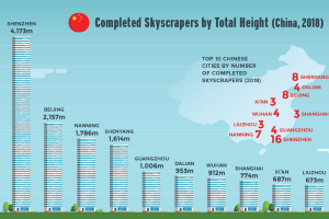
Nearly 150 skyscrapers were completed around the world last year. Find out which cities and regions are growing skyward the fastest. Read more

This animation shows the population density of U.S. counties between 1790 and 2010, showing the westward expansion of the country’s population. Read more
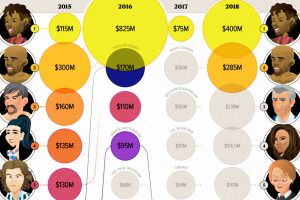
Celebrity status can be a powerful tool for building a fortune. These infographics visualize the world’s top earning celebrities, both living and dead. Read more
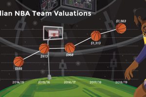
Buoyed by hefty broadcast agreements and superstars like LeBron James, NBA team valuations are hitting new heights. Let’s break down the data by team. Read more

An additional $2.1 trillion of spending will be needed to get America’s infrastructure back on track – here’s how that creates an opportunity for investors. Read more