

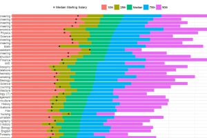
How do different college degrees compare for earning potential? This chart uses a data set from 1.2 million past students to compare 50 different majors. Read more

Check out these seven engineering wonders that were created by ancient civilizations without the use of modern technology. Read more
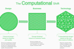
New tech is enabling an exciting but uncertain future for the design industry. See the forces shaping the future of design, and how these teams work together. Read more
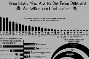
Science has given us insight into which behaviors may prolong or shorten life, but is there a universal, data-driven way to quantify death? Read more
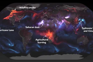
These stunning images from NASA give a whole new perspective on the massive wildfires engulfing the west coast of North America. Read more
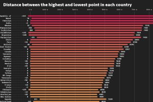
This data visualization compares the elevation span of every country, ranging from the mountain peaks of Bhutan, to the Dead Sea depression. Read more
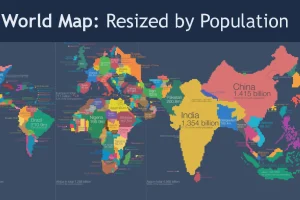
Look at global population in a whole new light, when countries on the world map are drawn based on population numbers instead of their usual borders. Read more

Fewer entrepreneurs today have formal business training. While the financial statement is not a glorified part of the startup dream, it’s essential learning. Read more
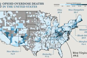
Drug overdoses are the leading cause of death for Americans under the age of 50. A hard look at the numbers behind this unparalleled public health crisis. Read more
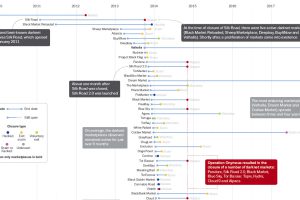
How often does a dark web marketplace last, on average? This data visualization offers a data-driven look at the survival rate of underground marketplaces. Read more