

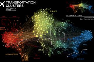
This unique network map of 3,200 air traffic hubs is a new way to visualize connectivity between the world’s population centers. Read more
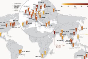
This data on the price of beer is fresh from the tap. See how much a pint of beer costs in 48 different major cities around the world. Read more
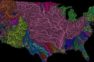
Nothing is more fundamental to life than water – so see the world’s watersheds like never before with these colorful and absolutely stunning maps. Read more
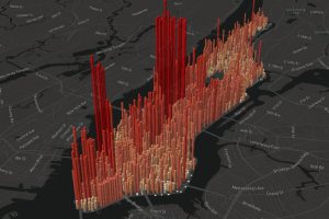
An eye-opening look at the population ‘heartbeat’ of Manhattan, which swells to an incredible four million people during an average workday. Read more
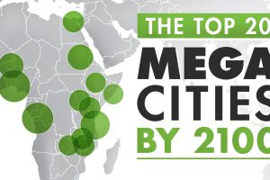
The world’s population centers are shifting rapidly, and by 2100, it is projected that the world’s largest megacities will exceed 70 million people. Read more
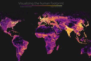
Our impact on the planet has been profound. Today’s graphic visualizes this human footprint by looking at population density, roads, undersea cables, and more. Read more
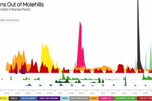
Visualizing sensationalism in the media. We also look at some of the most irresponsible Ebola headlines that stoked fears during the 2014 outbreak. Read more
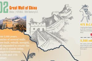
Counting down the most astounding civil engineering projects of all time, from the Great Wall of China to the Golden Gate Bridge. What holds the #1 spot? Read more
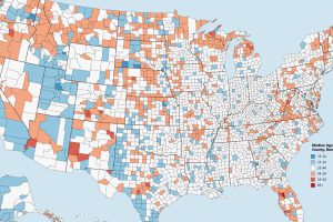
Which counties have the youngest populations, and which are meccas for aging retirees? This map shows the median age of every county in the United States. Read more
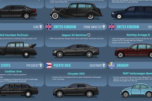
From bombproof luxury to vintage style, heads of state choose a wide variety of vehicles to get around. Read more