

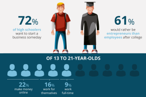
Gen Z is eager to change the world as young entrepreneurs, but can the upcoming generation get past the common pitfalls faced by people their age? Read more
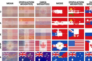
The average flag of the world, as well as different continents, if every flag were combined together. Also, a look at the building blocks of flag design. Read more

How a devastating series of cholera outbreaks in the 19th century inadvertently spurred innovation in the field of data visualization. Read more
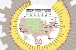
This infographic compares all U.S. states by average commute time, while also listing the top 10 cities with the longest and shortest commutes in the country. Read more

In just a half-century, Dubai has gone from a fishing village to a global real estate hub. Today’s video and graphic track the city’s stunning transformation. Read more
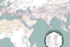
Long before container ships zig-zagged the oceans, caravans and single-sail cogs hauled goods across the world. This map is a fascinating look at that era. Read more
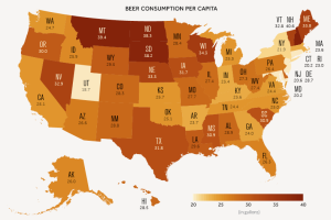
A data-driven look at consumption of America’s most popular alcoholic beverage: beer. Read more
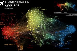
This unique network map of 3,200 air traffic hubs is a new way to visualize connectivity between the world’s population centers. Read more
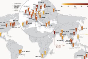
This data on the price of beer is fresh from the tap. See how much a pint of beer costs in 48 different major cities around the world. Read more
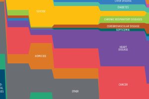
What causes of death do people worry the most about, and what types of death does media report on? It turns out both are very disproportionate to reality. Read more