
American whiskey is experiencing an impressive resurgence, but the road to the current bourbon boom hasn’t always been smooth. Read more

After decades of hyper-growth and worsening pollution, China has fully embraced rapid transit as a way to keep cities moving. Read more
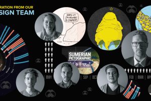
Visual Capitalist’s creative team highlights the motion graphics, data visualizations, and infographics that have inspired them. Read more

Brands are increasingly turning to social media celebs to move the needle on their sales numbers. Here’s what you need to know about influencer marketing. Read more

95% of the world’s oceans remain unexplored. Today’s video helps shed some light on just how deep the ocean is and what little we do know about the deep sea. Read more
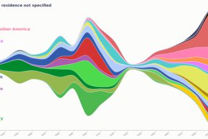
This series of maps and visualizations shows immigration in America starting in 1820. We also look at who identifies as having American ancestry today. Read more
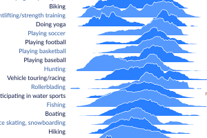
When are people doing activities like playing baseball or working out? This visualization shows how Americans spend free time, and when each activity peaks. Read more
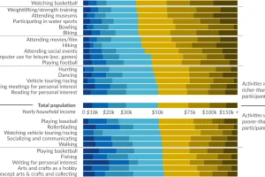
Ever wonder how people spend time? This data visualization shows favorite American past-times like playing baseball or watching TV by using income brackets. Read more
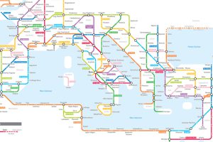
Navigating the mean streets of 125 AD just got a lot easier with this subway-style map of the ancient Roman road network. Read more
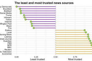
Which news sources do Americans trust, and which outlets do they consider to be full of it? See the results from this survey of >8,000 Americans. Read more

