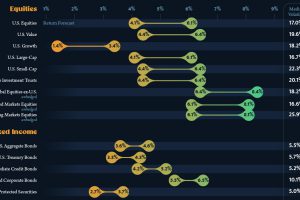
This infographic visualizes 10-year annualized forecasts for both equities and fixed income using data from Vanguard. Read more
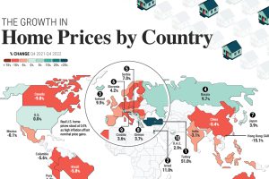
Global house prices were resilient in 2022, rising 6%. We compare nominal and real price growth by country as interest rates surged. Read more

Empty office space is hitting record highs in 2023. We show almost 1 billion square feet of unused space stacked as a single office tower. Read more
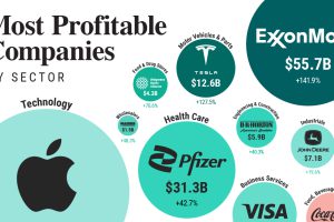
From Apple to Home Depot, we show America’s most profitable companies in their sector at a time of elevated inflation. Read more
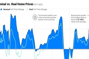
Home price growth has moderated amid rising interest rates and a narrow housing supply. Here’s how prices compare to historical trends. Read more
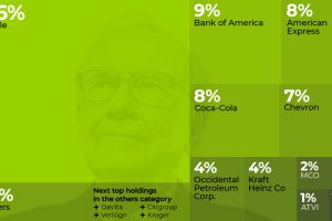
In this excerpt from our Markets This Month VC+ newsletter, we looked at how five portfolios of super investors shaped up at end of Q1 2023. Read more

In this visual we showcase the relative size of the 100 largest U.S. banks in terms of consolidated assets. Read more
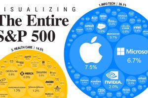
S&P 500 companies make up $34 trillion in market value combined. This graphic shows how they break down by weight and sector. Read more


