
Silicon Valley Bank was shuttered by regulators becoming the largest bank to fail since the height of the Financial Crisis. What happened? Read more
How free are people to control their own labor, property, and finances? This map reveals the state of economic freedom globally. Read more
Asset classes vary widely by returns so far in 2023. Which ones are the best-performing, and is a bull market on the horizon? Read more
This graphic visualizes the market capitalizations of America’s 15 largest semiconductor companies. Read more
By June 1, a debt ceiling agreement must be finalized. The U.S. could default if politicians fail to act—causing many stark consequences. Read more
Endowment funds represent the investment arms of nonprofits. See the worlds top 50, which collectively have over $1 trillion in assets. Read more

Reimagining all 200 million of the American workforce as 100 people: where do they all work, what positions they hold, and what jobs they do? Read more
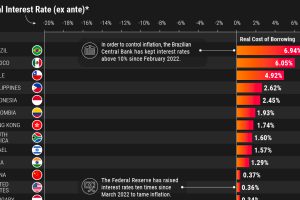
What countries have the highest real interest rates? We look at 40 economies to analyze nominal and real rates after projected inflation. Read more
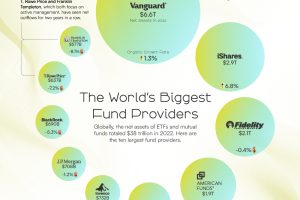
In 2022, the global net assets of mutual fund and ETF providers totaled $38 trillion. This chart shows the industry’s biggest brands. Read more
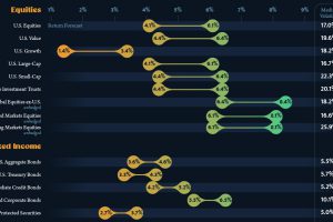
This infographic visualizes 10-year annualized forecasts for both equities and fixed income using data from Vanguard. Read more

