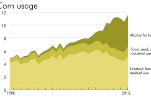
Lend an ear, because the shifting market for corn in the United States means big things for commodity investors. Read more
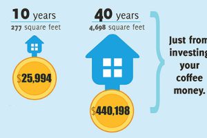
The difference between good and great is found in the details. As discussed in this infographic, a few little investing ideas can make a big difference. Read more
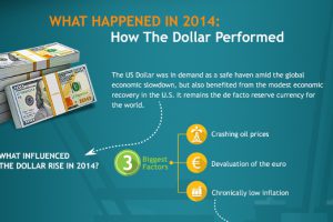
What is behind the US Dollar bull run? This infographic looks at the recent surge the dollar has had in 2014. Read more
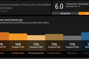
Robo-investing advisors take an investor’s preferences, time horizon, risk tolerance, and other information to create a wealth management plan using its algorithms. Read more
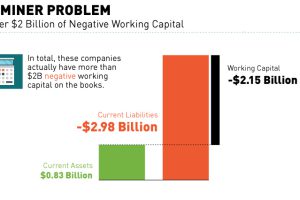
A recent report suggests that nearly 600 or 40% of listed mining companies in Canada do not meet continuous listing requirements. Read more
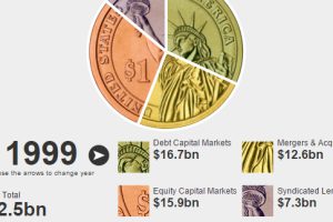
This interactive finance infographic shows the evolution of investment bank fees from 1996 until today. Read more
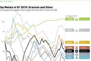
In 2015 Q1, silver and uranium led the way, while oil and natural gas struggled. See all returns in today’s Chart of the Week. Read more
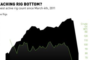
Oil rigs decline for the 17th straight week to 802, as drillers can do more with less. Yet, production is at highs and storage availability is running out. Read more

How did the European Debt Crisis begin? This video explains how countries in the Eurozone built up such troublesome debt. Read more
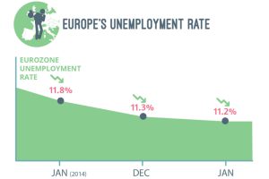
The statistics on youth unemployment, wage growth, inflation, migration, and demographics that show that the Eurozone Crisis is not yet over. Read more

