


Is your revenue model to get millions of ‘flies’, or just a few big ‘elephants’? This infographic looks at five different ways to hit $100 million in revenue. Read more
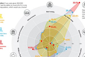
If someone handed you a $10,000 check to invest, what would you do with the money? We compare survey results on that question across generations. Read more

Which state could be hit hardest by a trade war? Here is every U.S. state organized by total economy size, and the share tied to international trade. Read more
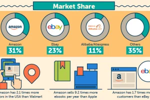
How many units does Amazon ship per second, and how much more do Prime members buy per year? See many, many facts on Amazon in this giant infographic. Read more
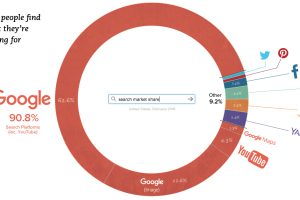
Yes, it’s a given that Google dominates the search market – but the fact is, Google is probably even more dominant than you would have guessed. Read more
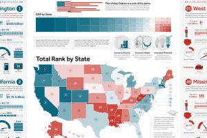
This giant infographic has state economies ranked from best to worst, based on an overall score comprised of 27 different metrics. Read more
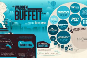
View the extent of the Warren Buffett Empire in this massive infographic, which shows the many, many household companies Berkshire Hathaway owns and controls. Read more
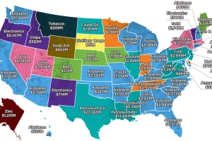
Largest state exports range from common goods, like autos, planes, and oil, to far more peculiar goods like distillery dregs, lobsters, and soda ash. Read more

The third infographic in our Rise of Tesla Series showcases Musk’s ambitious vision for the future of Tesla, along with the products that will make it possible. Read more
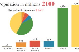
By 2100, the global population is projected to rise from 7.6 billion to 11.2 billion people. This animation shows how that growth will occur by region. Read more