

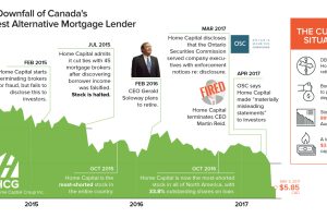
The events leading to the downfall of Home Capital, which is Canada’s largest alternative mortgage lender – and what it could mean for global investors. Read more

Bitcoin’s rise has been meteoric, but it’s not the only crypto game in town. Investors should be aware of altcoins such as Ethereum, Ripple, and others as well. Read more
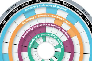
While they all have high expectations for economic growth, the risks facing emerging markets are very different. This visualization breaks it all down. Read more
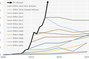
Forecasting the future of energy is not an easy task. These charts show how the experts have fared at forecasting solar over recent decades. Read more

See the ebbs and flows of regional unemployment in the United States in this animated map from 1990 until 2016. Read more
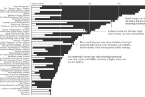
What types of jobs will be lost to automation? This data visualization applies probabilities from a well-cited study to current U.S. job numbers. Read more
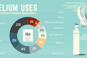
Helium is incredibly important for technology. Yet, because it is so light, it escapes into the atmosphere and is very limited in supply. Read more
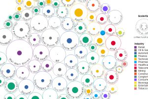
This data visualization compares the revenue and profit numbers for the top 100 companies by market valuation in the world. Read more
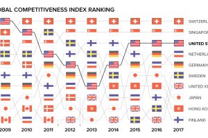
What makes a country competitive on the world stage? Today’s animation and interactive charts show global competitiveness over time, and how it’s measured. Read more
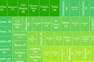
With rental prices rising sharply across the U.S., these interactive graphics show the trade-off between the cost and size in the 100 largest metro areas. Read more