

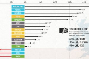
Commodities are back! Precious metals hit two-year highs post-Brexit, while oil and natural gas had their best quarter in years. Read more
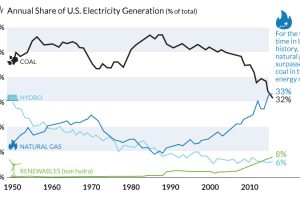
The decline of coal has been swift and unprecedented. We show in these three charts how it went from American energy hero to zero. Read more
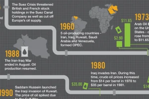
Oil is the world’s most traded commodity and a staple for investors – this infographic shows the volatile history of crude oil markets. Read more
What will be the driving factors behind global real estate investing over the coming years? This infographic covers three that are worth keeping an eye on. Read more
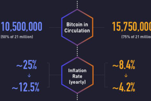
On July 9, 2016, the bitcoin halving event cut the rewards for mining in half. Today’s infographic explores the progress of bitcoin since the last halving. Read more
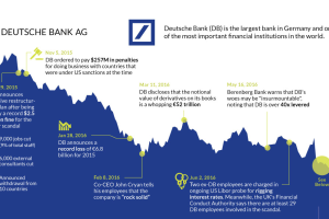
The fate of Germany’s largest bank appears to be sealed. This timeline shows the fall of Deutsche Bank, one of Europe’s most crucial financial institutions. Read more
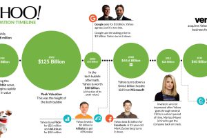
The roller coaster for Yahoo finally ends. This timeline shows where Yahoo execs went wrong during the company’s 20 year history. Read more
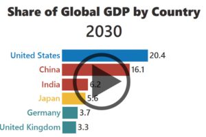
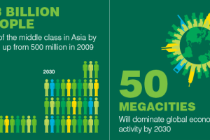
The rise of Asia has been swift. Here’s three GIFs that show the speed of China in becoming an economic power house – and how India is hot on their… Read more
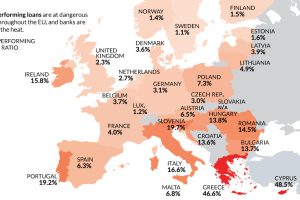
Despite the potential negative economic consequences, there is one reason a Brexit makes sense: non-performing loans and Europe’s troubled banking sector. Read more
There is no shortage of sights to see in this world. See which countries rake in the most tourist dollars with this infographic map. Read more