

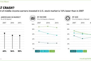
Polls show that fewer Americans are in the stock market than in the last two decades. The biggest casualties have been lower and middle income earners. Read more
These five charts show why gold stocks have never been cheaper. Read more

Ever wonder how your state compares in terms of economic output? This simple visualization compares the economies of every U.S. state. Read more
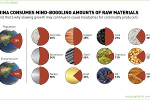
The 1.4 billion people living in China account for 13% of global GDP, but this chart shows that for commodity producers, the country means so much more. Read more
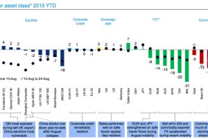
With August’s meltdown, most assets have had a rough year. This snapshot from Deutsche Bank shows YTD performance, and one market that has bucked the trend. Read more

In terms of actual capacity to pay debt, the United States has the 2nd highest amount in the world. We compare debt to revenue in this data visualization. Read more

With China’s slowing growth, and India lost in a maze of bureaucracy, who can we rely on as the emerging markets of the future? Read more

Watch the world economy evolve over 35 years in this video, which captures the breakdown of economic output by country. Read more
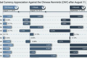
On August 11, China’s central banks shocked markets by devaluating the yuan in the biggest move in 20 years. Over one month later, here is the impact. Read more
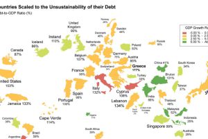
What if the world was remapped based on national debt levels? What would the largest country be? See the world map of debt. Read more