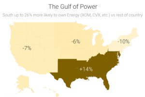
Recent data shows that investment portfolios are strongly biased to certain sectors based on where investors live. Read more
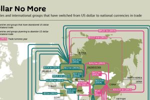
Recent trade deals and the creation of the Asian Infrastructure Investment Bank show the dollar is slowly losing its status as the primary reserve currency. Read more
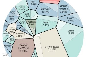
This data visualization is the most simple breakdown we have seen that shows the composition of the world economy. Read more
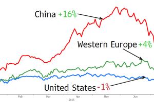
China’s stock market is a roller coaster, creating and destroying trillions of wealth in the matter of months. See how China’s ultra rich fared in the last month. Read more
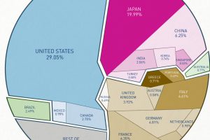
This data visualization shows total world debt by country and debt-to-GDP ratio. Read more
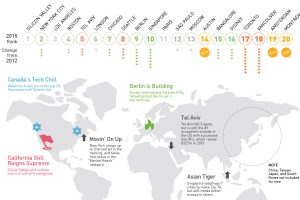
The latest Startup Ecosystem Ranking for 2015 shows Canadian markets struggling, Berlin and Singapore shooting up the rankings, and US still king in tech. Read more
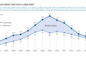
The story of Greece’s debt crisis through charts. The origin of the Greek crisis shown in bond yields, population, unemployment, timeline, and more. Read more
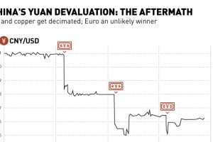
The People’s Bank of China shook markets this week with three separate yuan devaluations. Here’s the aftermath of these moves in currencies and commodities. Read more
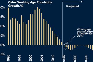
China has been at the forefront of economic growth for decades, but the Chinese growth engine is sputtering due to several factors including demographics. Read more
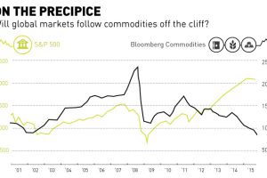
Commodities have fell off the cliff with oil and base metals getting crushed over the last year. Is the general market about to follow the same trend? Read more

