

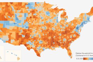
This interactive data visualization allows you to see median household income levels for every U.S. county – as well as the ability to sort data by state. Read more

Satellites get all the glory, but 99% of the world’s data actually flows through a vast network of fiber optic submarine cables. Read more
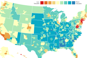
Every dollar spent is not equal. In some cities like NYC or SF, it will buy you far less – and in other places, a dollar has much more buying… Read more

How representative is social media of actual regional geographic populations? This map compares both numbers side by side with interesting results. Read more

Much of the world’s population surfs an internet that is at least partially censored, and this map shows to which degree that is true for every country. Read more
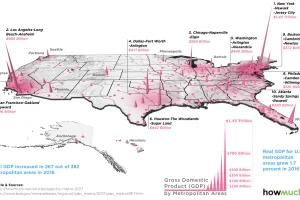
Which cities have the highest economic production in the country? This 3d map highlights GDP by metro area based on recent data. Read more
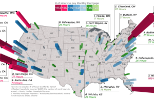
Every month, the average New Yorker needs 113.5 hours of work to pay down a mortgage, while in Memphis it’s just 18.4 hours. Read more

See the routes of U.S. Interstate Highways plotted in an intuitive and elegant fashion, in this transit-styled map. Read more
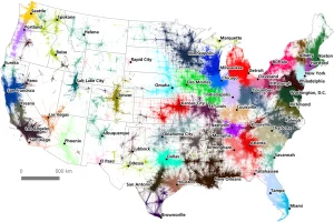
A massive commuter dataset and algorithmic approach have created a unique, new map of America’s megaregions. Read more
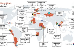
You’ve probably heard of Chinese cities like Beijing, Hong Kong, and Shanghai – but those actually only scratch the surface of China’s economic picture. Read more